## Median income by county. Defaults to 5-year estimates 2017-2021"
median_income_5yr <- get_acs(
  geography = "county",
variables = "B19013_001")Learning Objectives
- Review how the
tidycensuspackage works - Get acquaint on how to work with spatial census data
- Introduce tools to create static and interactive maps to visualize census data
Acknowledgement
This lesson is heavily based on Kyle Walker’s talk “Mapping And Spatial Analysis with ACS data in R” As part of the Census Data Workshops given at the University of Michigan in February 2023.
1.1 Census data with tidycensus
The tidycensus package (Walker and Matt (2021)) was developed to systematize the process of working with U.S Census data using R. It integrates the Census Application Programming Interface (API) released by the the U.S Census Bureau, into an R package to facilitate access to census data using R.
tidycensus main functions:
get_decennial()get_acs()get_estimates()get_pums()get_flows()
More details about these functions in the Intro to tidycensus lesson.
During this lesson we will used get_acs() to access and map data from the American Community Survey (ACS).
1.1.1 American Community Survey (ACS) recap
Provides detailed demographic information about US population. Covers topics not available in decennial US Census data (e.g. income, education, language, housing characteristics). It is an annual survey of 3.5 million US households. Data is updated annually through the 1-year estimates (for geographies of population 65,000 and greater). And it is also provided as a 5-year estimate. The 5-year ACS is a moving average of data over a 5-year period that covers geographies down to the Census block group. ACS data represent estimates rather than precise counts, therefore data includes margin of error.
Note
2020 1-year data only available as experimental estimates. Data delivered as estimates characterized by margins of error.
To access data of regions with population less than 65K, you have to youse the 5-year estimates ACS.
1.1.2 Review on get_acs()
get_acs() function from tidycensus streamlines the process of working with ACS data.
It wrangles Census data internally and returns queried data in “tidy” format.
Each request includes its associated margins of error.
You can filter by states and counties using their name (no more looking up FIPS codes!)”
AND..
- Automatically downloads and merges Census geometries to data for mapping.
This packages get the data for you, it shapes it in a format ready to go for analysis following the “tidy” principles, it pre joins the census geometries this means you get your data and spatial data automatically. And is streamlines the process of doing target requests.
- The functions has three main arguments
geography: The geographic area of your datavariable(s): Character string or vector of character strings of variable IDs.tidycensusautomatically returns the estimate and the margin of error associated with the variable.year: The year, or end-year, of the ACS sample. 5-year ACS data is available from 2009 through 2021; 1-year ACS data is available from 2005 through 2021, with the exception of 2020. Defaults to the 5-year estimates ACS for the most recent year of data available. As for now: 2017-2021 5-year ACS. Note: the default might update when the 2022 ACS data is released (expected to be released in December 2023).
For example to get the median income for all counties in the U.S:
In addition yu can filter by a specific State or County by adding the argument state= and/or county= and specify a region by their name.
Following the example above, if we want to get the median income for all counties in California, we have to add the agument state = "CA".
## Median income in California by county. Defaults to 5-year estimates 2017-2021"
median_income_5yr <- get_acs(
  geography = "county",
  variables = "B19013_001",
  state = "CA")
For more information about geographies and variables in tidycensus check out Walker, 2023.
Decennial Census
Complete enumeration of the US population to assist with apportionment. It asks a limited set of questions on race, ethnicity, age, sex, and housing tenure. Data from 2000, 2010, and available data from 2020.
Access this data using get_decennial()
1.2 Spatial Census Data in tidycensus
To be able to work with “spatial” Census data you would generally have to go and find shapefiles on the Census website, download a CSV with the data, clean and format the data, load the geometries and data to your spatial data software of choice, then align the key fields and join your data with the geometries.
Again, tidycensus to the rescue! This packages combines all these steps and makes it very easy to get census data nd its geometries ready for analysis. Let’s see how this work.
1.2.1 Spatial Census data with get_acs()
As usual we start by loading the libraries we are going to use today.
library(tidycensus)
library(mapview)
library(tigris)
library(ggplot2)
library(dplyr)
library(sf)
API Key
Remember that the first time you work with tidycensus you have to connect your session with the Census data using am API key.
- Go to https://api.census.gov/data/key_signup.html
- Fill out the form
- Check your email for your key.
- Use the
census_api_key()function to set your key. Note:install = TRUEforces r to write this key to a file in our R environment that will be read every time you use R. This means, by setting this argument toTRUE, you only have to do it once in any computer you are working. If you see this argument asFALSE, R will not remember this key next time you come back.
census_api_key("YOUR KEY GOES HERE", install = TRUE)- Lastly, restart R.
NOTE: WE DID THIS LAST TIME SO OUR SERVER SESSION SHOULD BE GOOD TO GO.
So now, if we want to retrieve data for income estimates by county for California with it’s associated geometries we need to know the variable for income estimates (“B19013_001”), call get_acs() with all the necessary information and add the argument geometry = TRUE to get the spatial data for each geography.
## defaults to most recent 5year estimates (2017-2021 5-year ACS)
ca_income <- get_acs(
    geography = "county",
    variables = "B19013_001",
    state = "CA",
    year = 2021,
    geometry = TRUE) ## This argument does all of the steps mentioned above.
Missleading error message
If you are getting an error about issues with the API, MAKE SURE YOU HAVE A VALID VARIABLE CODE. If the variable code is not valid, functions in tidycensus() can not access the API.
And that’s it!! Now we have the corresponding spatial data bind to our variable of interest. We can plot this data using the base r plot() function.
plot(ca_income["estimate"])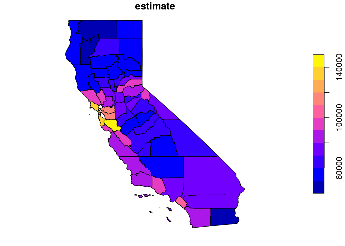
Now we have our data ready to start exploring!
1.2.2 What’s under the hood
The sf package. As we learned during the last training, the sf package implements a simple features data model for vector spatial data in R. This means that vector geometries: points, lines, and polygons stored in a list-column of a data frame. Making it very easy to work withe spatial data in R, just like you work with any other type of data, in a tabular format.
Let’s take a look at our data
head(ca_income)Simple feature collection with 6 features and 5 fields
Geometry type: MULTIPOLYGON
Dimension: XY
Bounding box: xmin: -124.4096 ymin: 33.21473 xmax: -117.4133 ymax: 42.00076
Geodetic CRS: NAD83
GEOID NAME variable estimate moe
1 06059 Orange County, California B19013_001 100485 718
2 06111 Ventura County, California B19013_001 94150 1310
3 06063 Plumas County, California B19013_001 57885 4555
4 06015 Del Norte County, California B19013_001 53280 5046
5 06023 Humboldt County, California B19013_001 53350 2424
6 06043 Mariposa County, California B19013_001 53304 4026
geometry
1 MULTIPOLYGON (((-118.1144 3...
2 MULTIPOLYGON (((-119.4412 3...
3 MULTIPOLYGON (((-121.497 40...
4 MULTIPOLYGON (((-124.2175 4...
5 MULTIPOLYGON (((-124.4086 4...
6 MULTIPOLYGON (((-120.3944 3...We can see that this is a Simple feature collection with 6 features and 5 fields. For those of you familiar with GIS, probably this is known terminology. But for those of you that this is all new, you can think of a feature as a simple shape on your data layer. Generally in a GIS perspective feature means a row in the data. In this case for example, Ventura County is a county and the shape of that county it self is a feature. And then, a field in GIS terminology means an attribute of the data or a column.
Similar how we saw last time in the Spatial Data lesson, we have a geometry column. This contains all the spatial information we need to map out data.
A polygon is a two dimensional shape that has a perimeter and an area. A multipolygon are multiple shapes that belong to the same feature. For example if we have census data for the state of Hawaii, we will have multiple polygon, one for each island, representing that row or feature. We also can see the CRS associated to this data and the bounding box that indicates the extension of our data set.
Coordinate Reference System (CRS)
How are the coordinates in our polygons referenced to the earth surface. It handles how the mapping of our data to the actual earth. For more information on CRS and tidycensus checkout Walker 2023
If we look at the other columns in our data, we have the data it self. GEOID, NAME, estimate and moe(margin of error, interpreted at 90% confidence level).
Note on missing data
Remember that 5 year ACS data are projections from a sample. Counties with no data means that the population in those counties is not large enough to make these projections.
1.2.3 Adding interactivity
For a lot of GIS users it is hard to transition from GIS to working with spatial data in R because GIS provides nice interactive tools. One easy way to make your R maps interactive is the mapview() package. This package wraps up different interactive mapping tools and allows you to explore your data just by running a single line of code. Let’s try this.
mapview(ca_income, zcol = "estimate")The zcol = argument, allows us to easily plot data to this interactive map. We can explore the data using the RStudio Viewer.
Let’s look at another example at a smaller census geography. tidycensus is really helpful to look at spatial data in smaller geography.
solano_income <- get_acs(
    geography = "tract",
    variables = "B19013_001",
    state = "CA",
    county = "Solano",
    geometry = "TRUE")

head(solano_income)
We can again use mapview() to check out our data.
mapview(solano_income, zcol = "estimate")With these two packages we can almost instantly explore different data from the ACS surveys. Note that for census tracts, the MOE will be much higher than for county data as estimates are extrapolated to a finer scale.
1.2.4 Spatial data structure in tidycensus (long versus wide)
The default of tidycensus is to return a data frame in a “long” format. This is generally the preferred way to work and analyze data in R. But, if you rather have a “wide” data frame as the output (GIS users are generally used to wide format) you can do that by adding the argument output = wide. This will return a data frame where each variable is in a different column. For example:
race_var <- c(
    Hispanic = "DP05_0071P",
    White = "DP05_0077P",
    Black = "DP05_0078P",
    Asian = "DP05_0080P")

## Default long
alameda_race <- get_acs(
  geography = "tract",
  variables = race_var,
  state = "CA",
  county = "Alameda",
  geometry = TRUE)

head(alameda_race)
Simple feature collection with 6 features and 5 fields
Geometry type: MULTIPOLYGON
Dimension: XY
Bounding box: xmin: -122.2588 ymin: 37.65598 xmax: -121.7804 ymax: 37.7547
Geodetic CRS: NAD83
GEOID NAME variable
1 06001451704 Census Tract 4517.04, Alameda County, California Hispanic
2 06001451704 Census Tract 4517.04, Alameda County, California White
3 06001451704 Census Tract 4517.04, Alameda County, California Black
4 06001451704 Census Tract 4517.04, Alameda County, California Asian
5 06001428301 Census Tract 4283.01, Alameda County, California Hispanic
6 06001428301 Census Tract 4283.01, Alameda County, California White
estimate moe geometry
1 11.5 4.3 MULTIPOLYGON (((-121.7985 3...
2 68.8 8.1 MULTIPOLYGON (((-121.7985 3...
3 0.0 0.9 MULTIPOLYGON (((-121.7985 3...
4 14.6 6.6 MULTIPOLYGON (((-121.7985 3...
5 9.9 6.1 MULTIPOLYGON (((-122.2588 3...
6 34.2 5.3 MULTIPOLYGON (((-122.2588 3...And now in wide format. Every variable (Hispanic, White, Black and Asian) is in a different column as opposed to being stacked into one column named variable.
alameda_race_wide <- get_acs(
  geography = "tract",
  variables = race_var,
  state = "CA",
  county = "Alameda",
  geometry = TRUE,
  output = "wide")

head(alameda_race_wide)
Simple feature collection with 6 features and 10 fields
Geometry type: MULTIPOLYGON
Dimension: XY
Bounding box: xmin: -122.2978 ymin: 37.5333 xmax: -121.7804 ymax: 37.87881
Geodetic CRS: NAD83
GEOID NAME HispanicE
1 06001451704 Census Tract 4517.04, Alameda County, California 11.5
2 06001428301 Census Tract 4283.01, Alameda County, California 9.9
3 06001407000 Census Tract 4070, Alameda County, California 37.2
4 06001422400 Census Tract 4224, Alameda County, California 15.1
5 06001423200 Census Tract 4232, Alameda County, California 29.0
6 06001444200 Census Tract 4442, Alameda County, California 32.9
HispanicM WhiteE WhiteM BlackE BlackM AsianE AsianM
1 4.3 68.8 8.1 0.0 0.9 14.6 6.6
2 6.1 34.2 5.3 4.8 4.1 43.0 6.8
3 10.4 18.3 6.7 15.2 5.3 18.2 7.5
4 4.4 36.5 6.6 2.7 2.0 39.5 9.7
5 7.9 33.3 8.2 20.5 8.6 11.4 5.6
6 6.5 22.3 4.5 0.4 0.5 37.6 5.8
geometry
1 MULTIPOLYGON (((-121.7985 3...
2 MULTIPOLYGON (((-122.2588 3...
3 MULTIPOLYGON (((-122.2098 3...
4 MULTIPOLYGON (((-122.2737 3...
5 MULTIPOLYGON (((-122.2978 3...
6 MULTIPOLYGON (((-122.0552 3...Both data frames alameda_race and alameda_race_wide have the same exact information. They are just in a different shape. Depending on what are you want to do with the data which one you should retrieve.
1.3 Working with Census Geometry

“Census and ACS data are associated with geographies, which are units at which the data are aggregated. These defined geographies are represented in the US Census Bureau’s TIGER/Line database, where the acronym TIGER stands for Topologically Integrated Geographic Encoding and Referencing. This database includes a high-quality series of geographic datasets suitable for both spatial analysis and cartographic visualization . Spatial datasets are made available as shapefiles, a common format for encoding geographic data.” (Walker 2023, Chapter 5)
tidycensususes thetigrisR package internally to acquire Census shapefilesBy default, the Cartographic Boundary shapefiles are used, which are pre-clipped to the US shoreline
tigrisoffers a number of features to help with acquisition and display of spatial ACS data. Making your work with ACS data better.
Let’s go back to our map of Solano County.
solano_income <- get_acs(
    geography = "tract",
    variables = "B19013_001",
    state = "CA",
    county = "Solano",
    geometry = "TRUE")

mapview(solano_income, zcol = "estimate")
We can see that there are some issues with the interior water areas. They are often not removed from the Cartographic Boundary shapefiles. What can we do about it? We can again leverage on how powerful these tools are on making complex process simple.
There is a function in the tigris package that “erase water”! It finds water areas in a shapefile and removes those water areas, giving you a result that allows you to better display your data. Let’s take a look on how this works.
sf_use_s2(FALSE) ## Need to run this so that mapview works.

solano_erase <- erase_water(solano_income,
                            year = 2021) ## year to use for water layer

mapview(solano_erase, zcol = "estimate")
And just like that! We get a much more accurate map of Solano County.
1.4 Mapping ACS data
There are a several extraordinary packages in R to visualize cartographic data. Today we are going to be using our good ol’ friend ggplot2. In the last section of this lesson you can find resources to other cartography mapping packages like tmap.
There is a reason why we use ggplot2 over and over throughout the lessons in this course. It is a very powerful data visualization tool! In fact, is one of the most downloaded packages in R. And, as we learned in the “working with spatial data” lesson, there is a function called geom_sf() that allows us to easily plot spatial data.
How do we plot ACS data using ggplot?
Lets make a map with the Hispanic population in Alameda County by Census tract.
Se we are going to use the alameda_race object we created earlier. And we are going to start by filtering the data for Hispanic population.
alameda_hispanic <- filter(alameda_race,
                           variable == "Hispanic")

ggplot(alameda_hispanic,
       aes(fill = estimate))+
    geom_sf() ## plots polygons!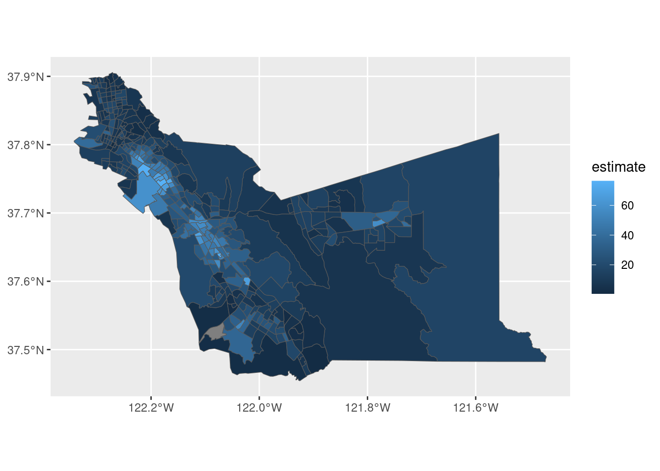
Here we have our choropleth map with the Hispanic population in Alameda County! A choropleth plot provides a shade or color to a polygon (or shape) according to a giving attribute (e.g. The percentage of Hispanic population)
Here we are mapping the estimate column to fill the shape we are plotting, in this case the tract polygon. The geom_sf() plots polygons!
A choropleth is a map that uses shading to show variation in some sort of data attribute. In this case, the lighter colors represent higher values, this means that tract with lighter shades of blue have higher Hispanic population. And the darker ares represent the lower values, fewer presence of Hispanic/Latino population.
As we know, with ggplot2 we can heavily style our plot. Here an example of customization.
ggplot(alameda_hispanic, aes(fill = estimate)) +
  geom_sf() +
  theme_void() +
  scale_fill_viridis_c(option = "rocket") +
  labs(title = "Percent Hispanic by Census tract",
       subtitle = "Alameda County, California",
       fill = "ACS estimate",
       caption = "2017-2021 ACS | tidycensus R package")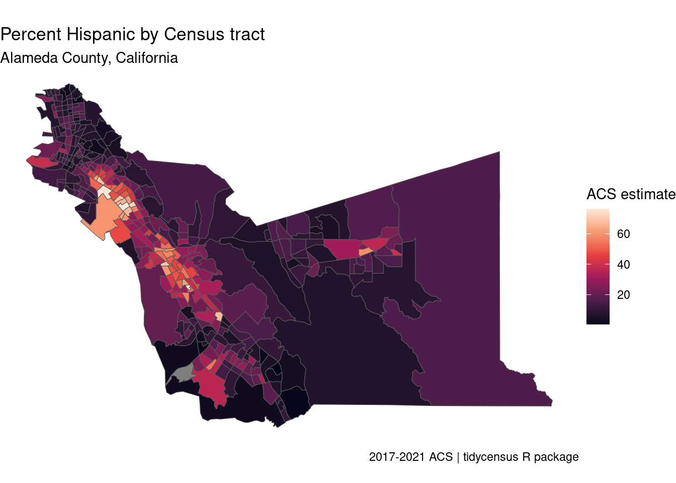
You can also plot you data in bins instead of a continuous scale.
ggplot(alameda_hispanic, aes(fill = estimate)) +
  geom_sf() +
  theme_void() +
  scale_fill_viridis_b(option = "rocket", n.breaks = 6) +
  labs(title = "Percent Hispanic by Census tract",
       subtitle = "Alameda County, California",
       fill = "ACS estimate",
       caption = "2017-2021 ACS | tidycensus R package")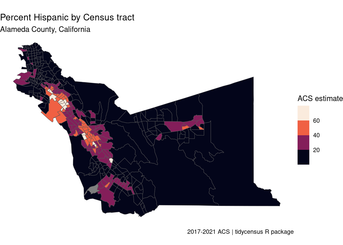
Which style to use will depends on what you want to achieve. We can see that in the plot with bins we loose some resolution. On the other hand the continuous scale can provide a little of a color over load.
We can keep leveraging on ggplot2 power and plot more variables of our data. For example create a map for each of the difference races on our data.
ggplot(alameda_race, aes(fill = estimate)) +
  geom_sf(color = NA) +  ## removes delimitation of each tract
  theme_void() +
  scale_fill_viridis_c(option = "rocket") +
  facet_wrap(~variable) +
  labs(title = "Race / ethnicity by Census tract",
       subtitle = "Alameda County, California",
       fill = "ACS estimate (%)",
       caption = "2017-2021 ACS | tidycensus R package")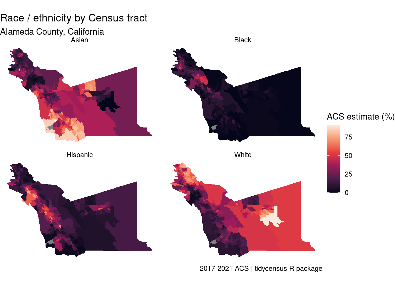
1.4.1 Mapping Count Data
So far we have been mapping percentage. But what if your data is not percentage but count? Choropleth are great for mapping ratios and percentage, but not so great for mapping counts. When you are working with count data, you wanna have a way to represent the extent of the count through symbols. We are going to show this with an example.
We start by getting the count data for race/ethnicity. Note that the process is practically the same that we did above, but there is a slight difference in the variable codes we are going to use. Generally, variables that end in “P” means the estimate is in percentage. Variable with out the “P” at the end are count data.
alameda_race_counts <- get_acs(
  geography = "tract",
  variables = c(
    Hispanic = "DP05_0071",
    White = "DP05_0077",
    Black = "DP05_0078",
    Asian = "DP05_0080"),
  state = "CA",
  county = "Alameda",
  geometry = TRUE)

## Checking our data. Estimates are in counts not in %
head(alameda_race_counts)
Simple feature collection with 6 features and 5 fields
Geometry type: MULTIPOLYGON
Dimension: XY
Bounding box: xmin: -122.2588 ymin: 37.65598 xmax: -121.7804 ymax: 37.7547
Geodetic CRS: NAD83
GEOID NAME variable
1 06001451704 Census Tract 4517.04, Alameda County, California Hispanic
2 06001451704 Census Tract 4517.04, Alameda County, California White
3 06001451704 Census Tract 4517.04, Alameda County, California Black
4 06001451704 Census Tract 4517.04, Alameda County, California Asian
5 06001428301 Census Tract 4283.01, Alameda County, California Hispanic
6 06001428301 Census Tract 4283.01, Alameda County, California White
estimate moe geometry
1 494 181 MULTIPOLYGON (((-121.7985 3...
2 2945 551 MULTIPOLYGON (((-121.7985 3...
3 0 13 MULTIPOLYGON (((-121.7985 3...
4 627 277 MULTIPOLYGON (((-121.7985 3...
5 729 501 MULTIPOLYGON (((-122.2588 3...
6 2523 485 MULTIPOLYGON (((-122.2588 3...The first map we are going to plot is a graduate symbol map. This kind of maps are good for count data because the comparison we are making are between symbols of the same shape. The size of the symbol is proportional to the underlying data value. The most common shape to use for this kind of plots are circles.
The tricky thing here, and this also speaks to really understanding our data and what we are trying to plot, is that our data is represented as polygons and we want to map points or circle. So we need to convert our data from polygons to circle.
As a reminder, polygons are closed shapes with a perimeter and an area. We have to convert this shape to a single point and draw a circle proportional to the corresponding data value.
There is a function from the sf package that allows us to do this. This function is st_centroid(). This function converts a shape, for example the shape of a census tract to a point, right in the center of that tract. So lets convert part of our Alameda race data to centroids. We are going to filter for the Asian population.
alameda_asian <- alameda_race_counts %>%
    filter(variable == "Asian")


centroids <- st_centroid(alameda_asian)
Warning message:
st_centroid assumes attributes are constant over geometries
This message is letting us know that you are converting a polygon to a single point, and this point might not truly represent where people in this tract live. Just a heads up of what is happening.
Now we plot. Note that we are plotting two layers. One with the polygons to provide context to our data and the other one with the actual data transformed into centroids.
ggplot() +
  geom_sf(data = alameda_asian, color = "black", fill = "lightgrey") +
  geom_sf(data = centroids, aes(size = estimate),
          alpha = 0.7, color = "navy") +
  theme_void() +
  labs(title = "Asian population by Census tract",
       subtitle = "2017-2021 ACS, Alameda County, California",
       size = "ACS estimate") +
  scale_size_area(max_size = 6)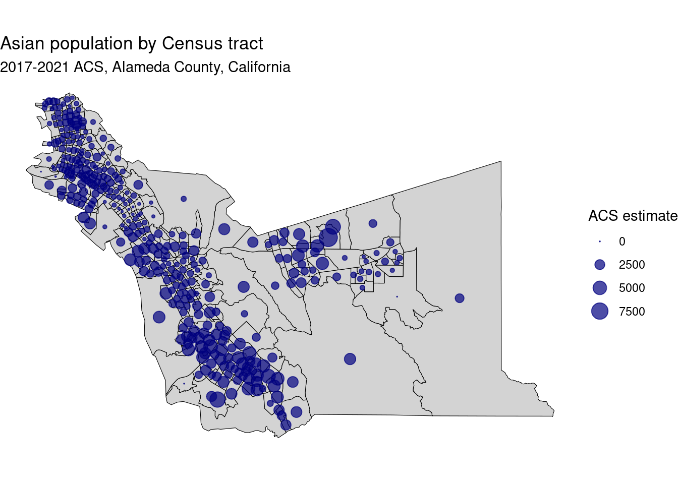
scale_size_area() argument makes the area of the circles proportional. In this case the area representing 2500 is about half of the area of the 5000 circle. Overall, areas with smaller circles are areas with less Asian population and areas with larger circles have a larger Asian population. This kind of maps makes it easier to visualize change across the different area. For example, larger counts with a very low Asian population are represented with a small circle instead of painting the whole are with a color that represents a low population.
We can compere location of a point and size according to the estimated value of the population.
Another way of plotting count data is with a dot-density map. This kind of maps excel at plotting multiple variables in one map. On the graduate symbol map, we were able to plot the Asian population and clearly see how it changes among census tract. However, the graduate symbol map doesn’t really allow as to to plot heterogeneity, or the mixing of different racial groups in this case. For example to see how different groups live together or apart. Dot-density maps scatter dots proportionally to data size; dots can be colored to show mixing of categories.
The as_dot_density() function allows you to calculate these density dots based on your data. It is design for categorical mapping of ACS and Census Decennial data, taking data in a long format as an input. The other arguments relevant to this function are:
value =assigning the column in our data frame that has the values we want to transform to dots. In this case ourestimatecolumn.values_per_dot =dot to data ratio, how many data points does each dot represent. In this casevalues_per_dot = 200means that each dot represents 200 people.group =is an argument that allow as to group out data. In this casegroup = "variable"groups the data by each of the categories in thevariablecolumn and creates a dot for each of those categories.
alameda_race_dots <- as_dot_density(
  alameda_race_counts,
  value = "estimate",
  values_per_dot = 200,
  group = "variable"
)
although coordinates are longitude/latitude, st_intersects assumes that they
are planarThere are a lot of calculations happening under the hood here. What this function is doing is scattering dots with each census tract proportional to the number of people that are in each group (in this case groups are defined by the categories in the variable column).
Let’s look at the outcome data. We can already see that this data frame has many more rows than our input data. This is because, each row in this case just represents up to 200 people, as we defined in the values_per_dot argument. We can also see that we have a geometry type POINT.
head(alameda_race_dots)Simple feature collection with 6 features and 5 fields
Geometry type: POINT
Dimension: XY
Bounding box: xmin: -122.2775 ymin: 37.54923 xmax: -121.7397 ymax: 37.86443
Geodetic CRS: NAD83
GEOID NAME variable
1 06001408800 Census Tract 4088, Alameda County, California Hispanic
2 06001451201 Census Tract 4512.01, Alameda County, California Asian
3 06001407400 Census Tract 4074, Alameda County, California Hispanic
4 06001423000 Census Tract 4230, Alameda County, California White
5 06001433104 Census Tract 4331.04, Alameda County, California Hispanic
6 06001442602 Census Tract 4426.02, Alameda County, California Asian
estimate moe geometry
1 3718 1104 POINT (-122.2006 37.75528)
2 1274 378 POINT (-121.7397 37.70507)
3 2168 470 POINT (-122.2096 37.77181)
4 2963 641 POINT (-122.2775 37.86443)
5 1095 499 POINT (-122.1444 37.71068)
6 1691 275 POINT (-121.9998 37.54923)Now we can plot this data using the same workflow than our previews map.
ggplot() +
  geom_sf(data = alameda_race_counts, color = "lightgrey", fill = "white") +
  geom_sf(data = alameda_race_dots, aes(color = variable), size = 0.5, alpha = 0.8) +
  scale_color_brewer(palette = "Set2") +
  guides(color = guide_legend(override.aes = list(size = 3))) + ## overrides the size of the dots in the legend to make it more visible
  theme_void() +
  labs(color = "Race / Ethnicity",
       caption = "2017-2021 ACS | 1 dot = approximately 200 people")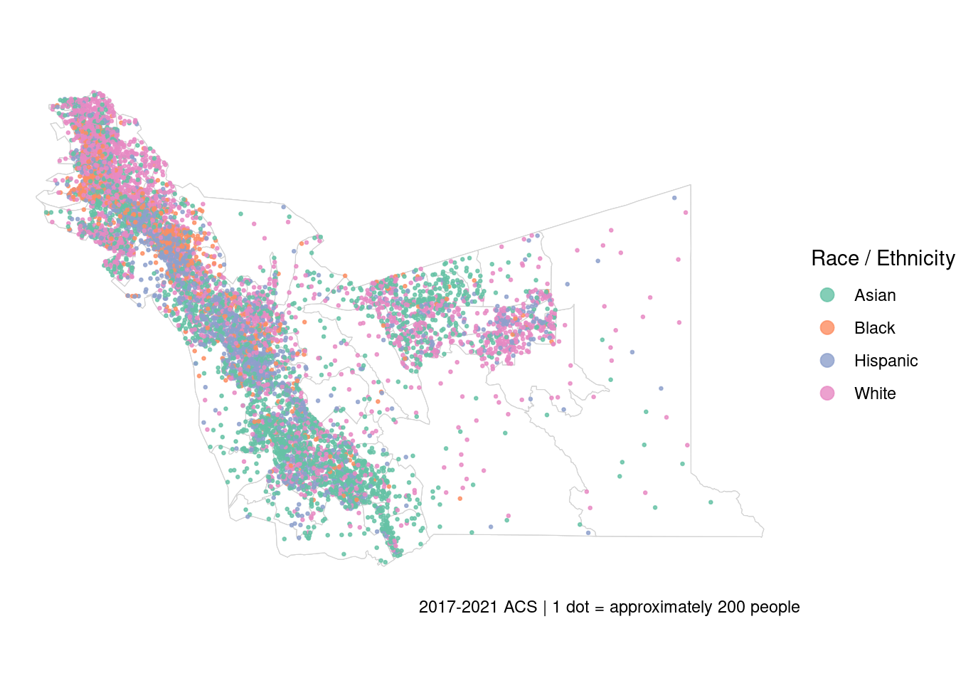
Here we have our map. Each dot represent 200 people and each color a race or ethnicity. This allows us to wee the distribution through out the county and the areas with more racial mix and areas where one race predominates.
These are some of the examples of plotting census data or ACS in this case using static maps. There is a lot more to cover when talking about maps! So we encourage you to check out the resources linked below.
1.5 Resources
- The
tmappackage (Tennekes 2018) is an alternative toggplot2for creating custom maps. T stands for “Thematic”, refering to the phenomena that is shown or plotted, for example demographical, social, cultural, or economic phenomena. This package includes a wide range of functionality for custom cartography. Example oftmapandtidycensusin Walker 2023, Chapter 6 - Reactive mapping with
Shiny - Spatial Analysis with Census Data, Walker 2023, Chapter 7
- Modeling Census Data, Walker 2023 Chapter 8. Indices for segregation and diversity are addresed in this chapter.
1.6 Your Turn
Now is your turn to make some maps!
Exercise
- Use the
load_variables()function to find one or more variables of your interest.
Answer
vars_acs5 <- load_variables(2021, "acs5")- Use
get_acs()to get spatial ACS data for the variable you selected in a location and geography of your choice.
Answer
## Data for median gross rent by county in CA
ca_rent <- get_acs(
  geography = "county",
  variables = "B25031_001",
  state = "CA",
  year = 2021,
  geometry = TRUE)

## Data for median household income by county in CS
ca_income_county <- get_acs(
    geography = "county",
    variables = "B19013E_001",
    state = "CA",
    year = 2021,
    geometry = TRUE)
Use any of the resources presented above to map the data.
Share your maps on Slack!