library(readr)
library(dplyr)
library(tidyr)
library(ggplot2)
library(janitor) # expedite cleaning and exploring data
library(scales) # scale functions for visualizationLearning Objectives
- Understand the fundamentals of how the
ggplot2package works - Use
ggplot2’s theme and other customization functions to create publication-grade graphics - Introduce the
leafletandDTpackage to create interactive maps and tables respectively
10.1 Overview
ggplot2 is a popular package for visualizing data in R. From the home page:
ggplot2is a system for declaratively creating graphics, based on The Grammar of Graphics. You provide the data, tellggplot2how to map variables to aesthetics, what graphical primitives to use, and it takes care of the details.
It’s been around for years and has pretty good documentation and tons of example code around the web (like on StackOverflow). The goal of this lesson is to introduce you to the basic components of working with ggplot2 and inspire you to go and explore this awesome resource for visualizing your data.
ggplot2 vs base graphics in R vs others
There are many different ways to plot your data in R. All of them work! However, ggplot2 excels at making complicated plots easy, and easy plots simple enough.
Base R graphics (plot(), hist(), etc) can be helpful for simple, quick, and dirty plots. ggplot2 can be used for almost everything else. And really, once you become familiar with how it works, you’ll discover it’s great for simple and quick plots as well.
Let’s dive into creating and customizing plots with ggplot2.
Setup
Make sure you’re in the right project (
training_{USERNAME}), create a new Quarto document, delete the default text, and save this document.Load the packages we’ll need for the
ggplot2exploration and exercises.
- Read in the data table that we’ll be exploring and visualizing below. We’ll read it into R directly over the web from the KNB Data Repository. To get the URL pointing at the publically archived CSV, visit the landing page for the data package at Daily salmon escapement counts from the OceanAK database, Alaska, 1921-2017, hover over the “Download” button for the
ADFG_firstAttempt_reformatted.csv, right click, and select “Copy Link”.
escape_raw <- read_csv("https://knb.ecoinformatics.org/knb/d1/mn/v2/object/urn%3Auuid%3Af119a05b-bbe7-4aea-93c6-85434dcb1c5e")Learn about the data. For this session we are going to be working with data on daily salmon escapement counts in Alaska. If you didn’t read the data package documentation in the previous step, have a look now.
Finally, let’s explore the data we just read into our working environment.
## Check out column names
colnames(escape_raw)

## Peak at each column and class
glimpse(escape_raw)

## From when to when
range(escape_raw$sampleDate)

## Which species?
unique(escape_raw$Species)
10.2 Getting the data ready
In most cases, we need to do some wrangling before we can plot our data the way we want to. Now that we have read in the data and have done some exploration, we’ll put our data wrangling skills to practice getting our data in the desired format.
Side note on clean column names
janitor::clean_names() is an awesome function to transform all column names into the same format. The default format for this function is snake_case_format. We highly recommend having clear well formatted column names. It makes your life easier down the line.
How it works?
escape <- escape_raw %>%
    janitor::clean_names()
And that’s it! If we look at the column names of the object escape, we can see the columns are now all in a lowercase, snake format.
colnames(escape)[1] "location" "sasap_region" "sample_date" "species" "daily_count"
[6] "method" "latitude" "longitude" "source"
Exercise
- Add a new column for the sample
year, derived fromsample_date - Calculate annual escapement by
species,sasap_region, andyear - Filter the main 5 salmon species (Chinook, Sockeye, Chum, Coho and Pink)
annual_esc <- escape %>%
    filter(species %in% c("Chinook", "Sockeye", "Chum", "Coho", "Pink")) %>%
    mutate(year = lubridate::year(sample_date)) %>%
    group_by(species, sasap_region, year) %>%
    summarize(escapement = sum(daily_count))

head(annual_esc)
# A tibble: 6 × 4
# Groups: species, sasap_region [1]
species sasap_region year escapement
<chr> <chr> <dbl> <dbl>
1 Chinook Alaska Peninsula and Aleutian Islands 1974 1092
2 Chinook Alaska Peninsula and Aleutian Islands 1975 1917
3 Chinook Alaska Peninsula and Aleutian Islands 1976 3045
4 Chinook Alaska Peninsula and Aleutian Islands 1977 4844
5 Chinook Alaska Peninsula and Aleutian Islands 1978 3901
6 Chinook Alaska Peninsula and Aleutian Islands 1979 10463The chunk above used some dplyr commands that we’ve used previously, and some that are new. First, we use a filter with the %in% operator to select only the salmon species. Although we would get the same result if we ran this filter operation later in the sequence of steps, it’s good practice to apply filters as early as possible because they reduce the size of the dataset and can make the subsequent operations faster. The mutate() function then adds a new column containing the year, which we extract from sample_date using the year() function in the helpful lubridate package. Next we use group_by() to indicate that we want to apply subsequent operations separately for each unique combination of species, region, and year. Finally, we apply summarize() to calculate the total escapement for each of these groups.
10.3 Plotting with ggplot2
10.3.1 Essential components
First, we’ll cover some ggplot2 basics to create the foundation of our plot. Then, we’ll add on to make our great customized data visualization.
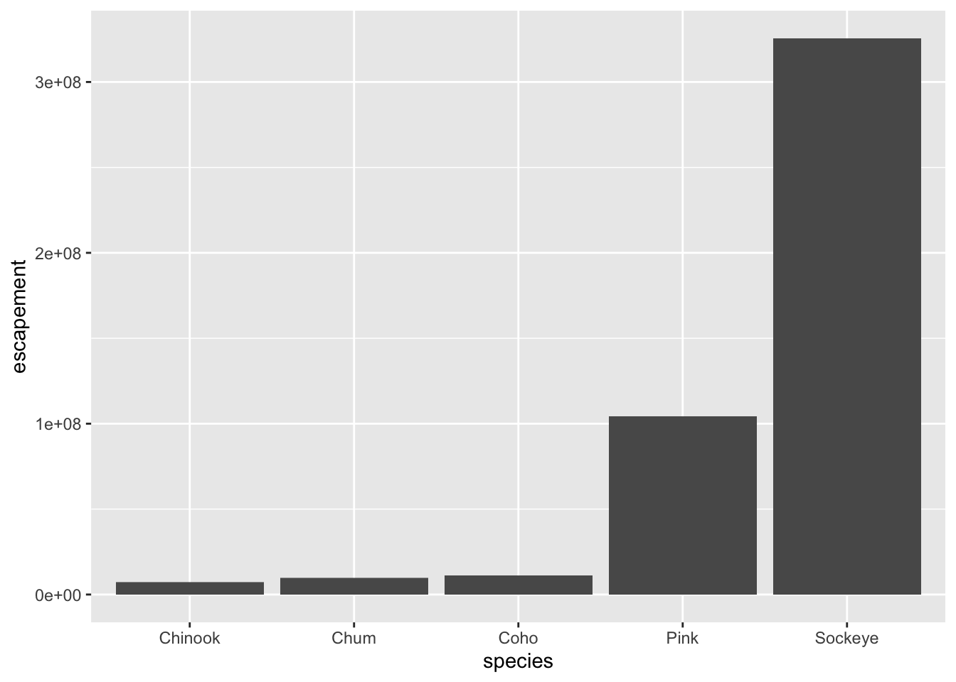
For example, let’s plot total escapement by species. We will show this by creating the same plot in 3 slightly different ways. Each of the options below have the essential pieces of a ggplot.
## Option 1 - data and mapping called in the ggplot() function
ggplot(data = annual_esc,
       aes(x = species, y = escapement)) +
    geom_col()

## Option 2 - data called in ggplot function; mapping called in geom
ggplot(data = annual_esc) +
    geom_col(aes(x = species, y = escapement))


## Option 3 - data and mapping called in geom
ggplot() +
    geom_col(data = annual_esc,
             aes(x = species, y = escapement))
They all will create the same plot:
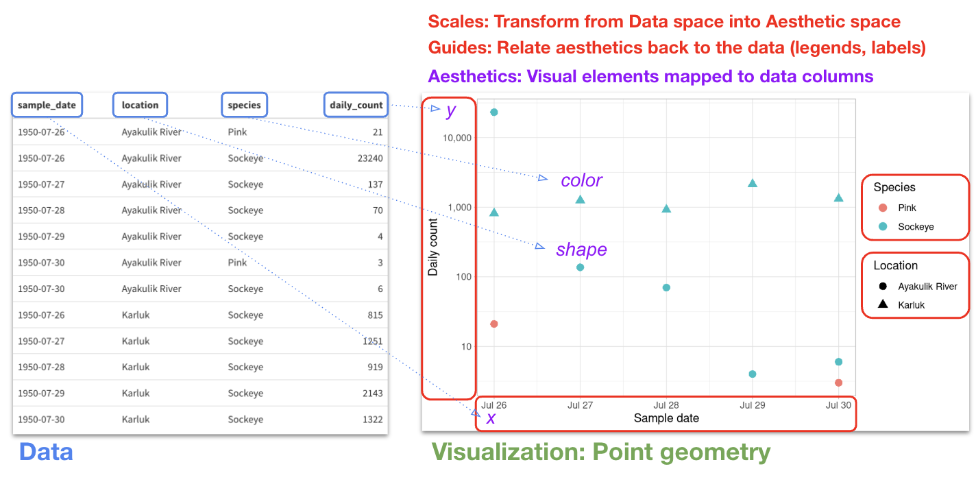
Let’s take a minute to review a few of the core components of a ggplot2 visualization, and see how they relate back to the data that we are plotting. Consider this small subset of 12 records from our escapement data, and a corresponding scatterplot of daily fish counts across 5 days for a particular region.
10.3.2 Looking at different geoms
Having the basic structure with the essential components in mind, we can easily change the type of graph by updating the geom_*().
ggplot2 and the pipe operator
Remember that the first argument of ggplot is the data input. Just like in dplyr and tidyr, we can also pipe a data.frame directly into the first argument of the ggplot function using the %>% operator. This means we can create expressions that start with data, pipe it through various tidying and restructuring operations, then pipe into a ggplot call which we then build up as described above.
This can certainly be convenient, but use it carefully! Combining too many data-tidying or subsetting operations with your ggplot call can make your code more difficult to debug and understand. In general, operations included in the pipe sequence preceding a ggplot call should be those needed to prepare the data for that particular visualization, whereas pre-processing steps that more generally prepare your data for analysis and visualization should be done separately, producing a new named data.frame object.
Next, we will use the pipe operator to pass into ggplot() a filtered version of annual_esc, and make a plot with different geometries.
Line and point
Let’s start with a line and point visualization.
annual_esc %>%
    filter(species == "Sockeye",
           sasap_region == "Bristol Bay") %>%
    ggplot(aes(x = year, y = escapement)) +
    geom_line() +
    geom_point()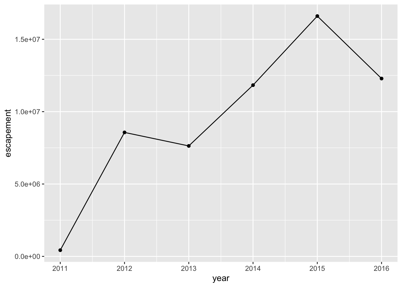
Here we are added two layers to the plot. They are drawn in the order given in the expression, which means the points are drawn on top of the lines. In this example, it doesn’t make a difference, but if you were to use different colors for the lines and points, you could look closely and see that the order matters where the lines overlap with the points.
Also notice how we included the aesthetic mapping in the ggplot call, which means this mapping was used by both of the layers. If we didn’t supply the mapping in the ggplot call, we would need to pass it into both of the layers separately.
Boxplot
Now let’s try a box plot.
annual_esc %>%
    filter(year == 1974,
          species %in% c("Chum", "Pink")) %>%
    ggplot(aes(x = species, y = escapement)) +
    geom_boxplot()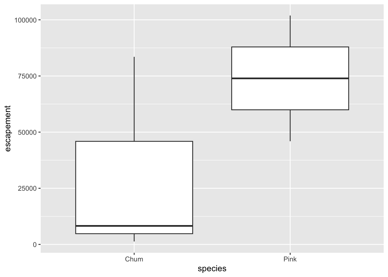
Notice how we again provided aesthetic mappings for both x and y. Let’s think about how the behavior of these two aesthetics is different in this plot compared with the point and line plot.
Whereas in the previous example we set x to the continuous variable year, here we use the discrete variable species. But it still worked! This is handled by a so-called scale, another component of the ggplot2 grammar. In short, scales convert the values in your data to corresponding aesthetic values in the plot. You typically don’t have to worry about this yourself, because ggplot2 chooses the relevant scale based on your input data type, the corresponding aesthetic, and the type of geom. In the plot above, ggplot2 applied its discrete x-axis scale, which is responsible for deciding how to order and space out the discrete set of species values along the x axis. Later we’ll see how we can customize the scale in some cases.
The y aesthetic also seems different in this plot. We mapped the y aesthetic to the escapement variable, but unlike in the point & line diagram, the plot does not have raw escapement values on the y-axis. Instead, it’s showing statistical properties of the data! How does that happen? The answer involves stats, one of the final key components of the ggplot2 grammar. A stat is a statistical summarization that ggplot2 applies to your data, producing a new dataframe that it then uses internally to produce the plot. For geom_boxplot, ggplot2 internally applies a stat_boxplot to your input data, producing the statistics needed to draw the boxplots. Fortunately, you will rarely ever need to invoke a stat_* function yourself, as each geom_* has a corresponding stat_* that will almost always do the job. But it’s still useful to know this is happening under the hood.
The identity stat
If ggplot2 applies a statistical transformation to your data before plotting it, then how does the geom_point plot only your raw values? The answer is that this and other geometries use stat_identity, which leaves the data unchanged! Although this might seem unnecessary, it allows ggplot to have a consistent behavior where all input dataframes are processed by a stat_* function before plotting, even if sometimes that step doesn’t actually modify the data.
Violin plot
Finally, let’s look at a violin plot. Other than the geom name itself, this expression is identical to what we used to produce the boxplot above. This is a nice example of how we can quickly switch visualization types – and in this case, the corresponding statistical summarization of our data – with a small change to the code.
annual_esc %>%
    filter(year == 1974,
           species %in% c("Chum", "Pink")) %>%
    ggplot(aes(x = species, y = escapement)) +
    geom_violin()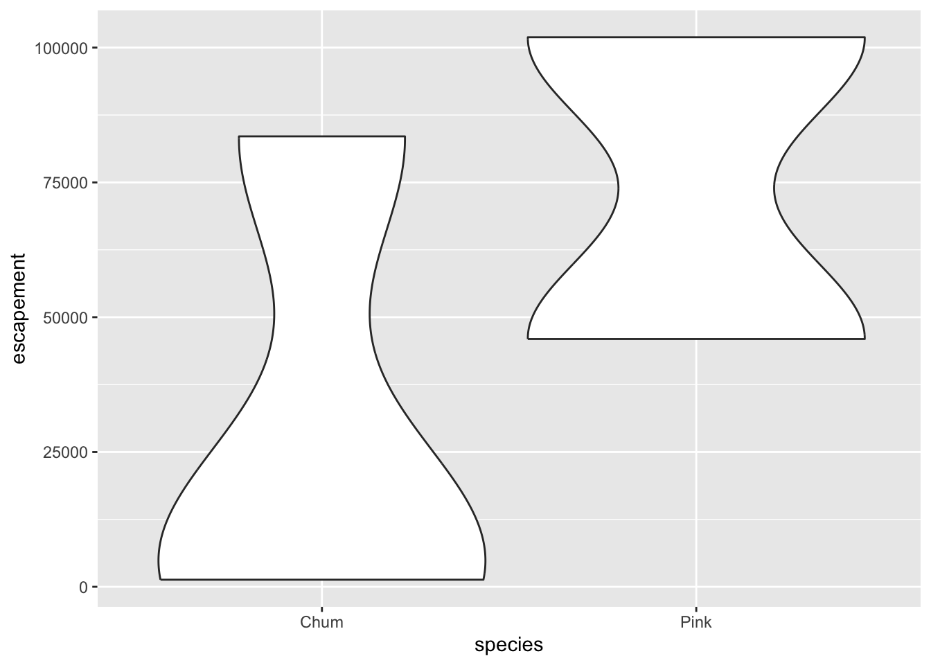
10.3.3 Customizing our plot
Let’s go back to our base bar graph. What if we want our bars to be blue instead of gray? You might think we could run this:
ggplot(annual_esc,
       aes(x = species, y = escapement,
           fill = "blue")) +
    geom_col()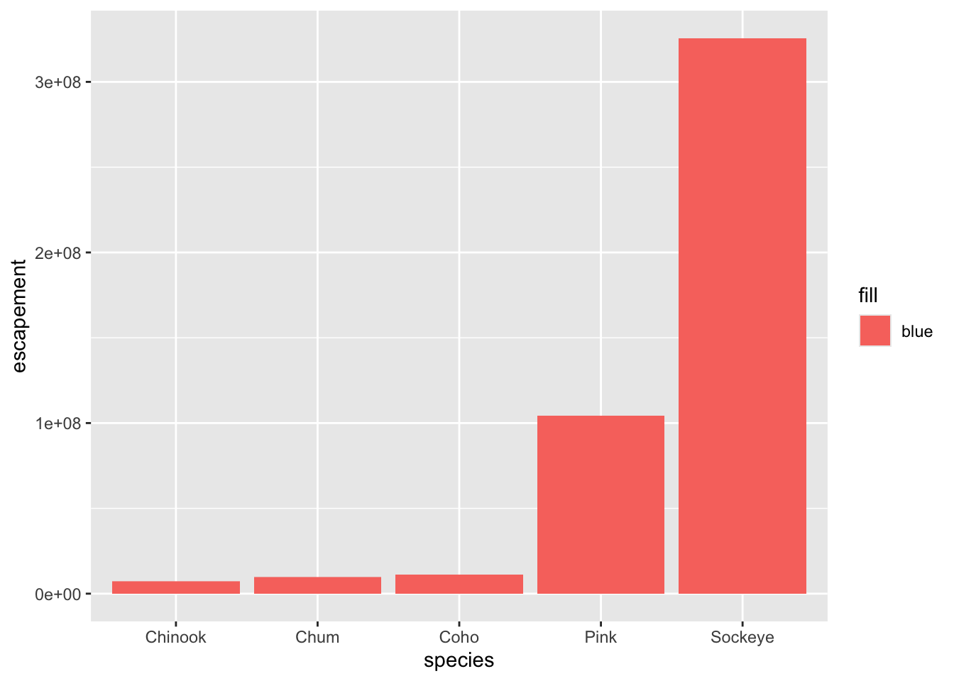
Why did that happen?
Notice that we tried to set the fill color of the plot inside the mapping aesthetic call. What we have done, behind the scenes, is create a column filled with the word “blue” in our data frame, and then mapped it to the fill aesthetic, which then chose the default fill color of red.
What we really wanted to do was just change the color of the bars. To do this, we can call the fill color option in the geom_col() function, outside of the mapping aesthetics function call.
ggplot(annual_esc,
       aes(x = species, y = escapement)) +
    geom_col(fill = "blue")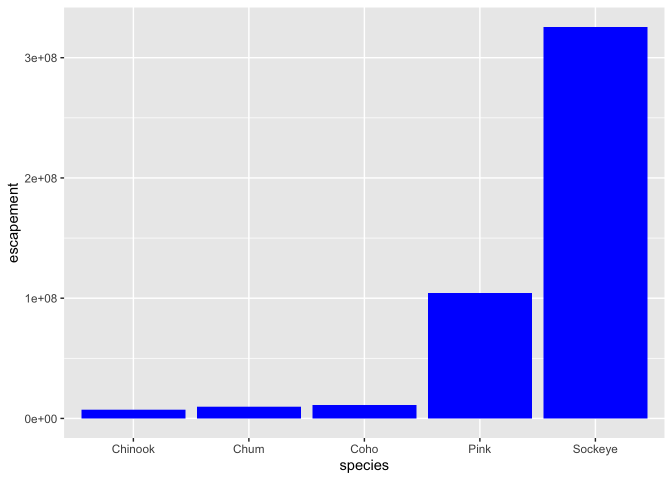
What if we did want to map the color of the bars to a variable, such as region? ggplot() is really powerful because we can easily get this plot to visualize more aspects of our data.
ggplot(annual_esc,
       aes(x = species, y = escapement,
           fill = sasap_region)) +
    geom_col()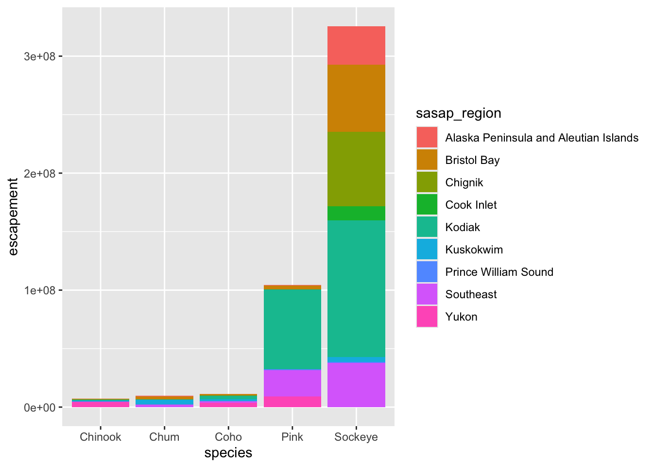
10.3.3.1 Creating multiple plots
We know that in the graph we just plotted, each bar includes escapements for multiple years. Let’s leverage the power of ggplot to plot more aspects of our data in one plot.
An easy way to plot another “dimension” of your data is by using facets. Faceting involves splitting your data into desigated groups, and then having ggplot2 create a multi-paneled figure in which all panels contain the same type of plot, but each visualizing data from only one of the groups. The simplest ggplot2 faceting function is facet_wrap(), which accepts a mapping to a grouping variable using the syntax ~{variable_name}. The ~ (tilde) is a model operator which tells facet_wrap() to model each unique value within variable_name to a facet in the plot.
The default behavior of facet wrap is to put all facets on the same x and y scale. You can use the scales argument to specify whether to allow different scales between facet plots (e.g scales = "free_y" to free the y axis scale). You can also specify the number of columns using the ncol = argument or number of rows using nrow =.
To demonstrate how this works, first let’s create a smaller data.frame containing escapement data from 2000 to 2016.
## Subset with data from years 2000 to 2016

annual_esc_2000s <- annual_esc %>%
    filter(year %in% c(2000:2016))

## Quick check
unique(annual_esc_2000s$year)
[1] 2000 2001 2002 2003 2004 2005 2006 2007 2008 2009 2010 2011 2012 2013 2014
[16] 2015 2016Now let’s plot escapement by species over time, from 2000 to 2016, with separate faceted panels for each region.
ggplot(annual_esc_2000s,
       aes(x = year,
           y = escapement,
           color = species)) +
    geom_line() +
    geom_point() +
    facet_wrap( ~ sasap_region,
                scales = "free_y")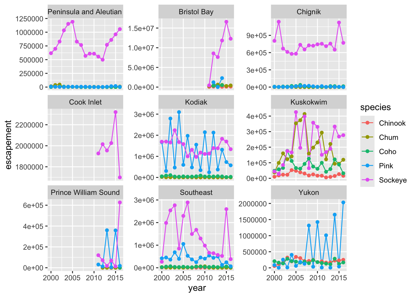
10.3.3.2 Setting ggplot themes
Now let’s work on making this plot look a bit nicer. We are going to:
- Add a title using
labs() - Adjust labels using
labs() - Include a built in theme using
theme_bw()
There are a wide variety of built in themes in ggplot that help quickly set the look of the plot. Use the RStudio autocomplete theme_ <TAB> to view a list of theme functions.
ggplot(annual_esc_2000s,
       aes(x = year,
           y = escapement,
           color = species)) +
    geom_line() +
    geom_point() +
    facet_wrap( ~ sasap_region,
                scales = "free_y") +
    labs(title = "Annual Salmon Escapement by Region",
         y = "Escapement") +
    theme_bw()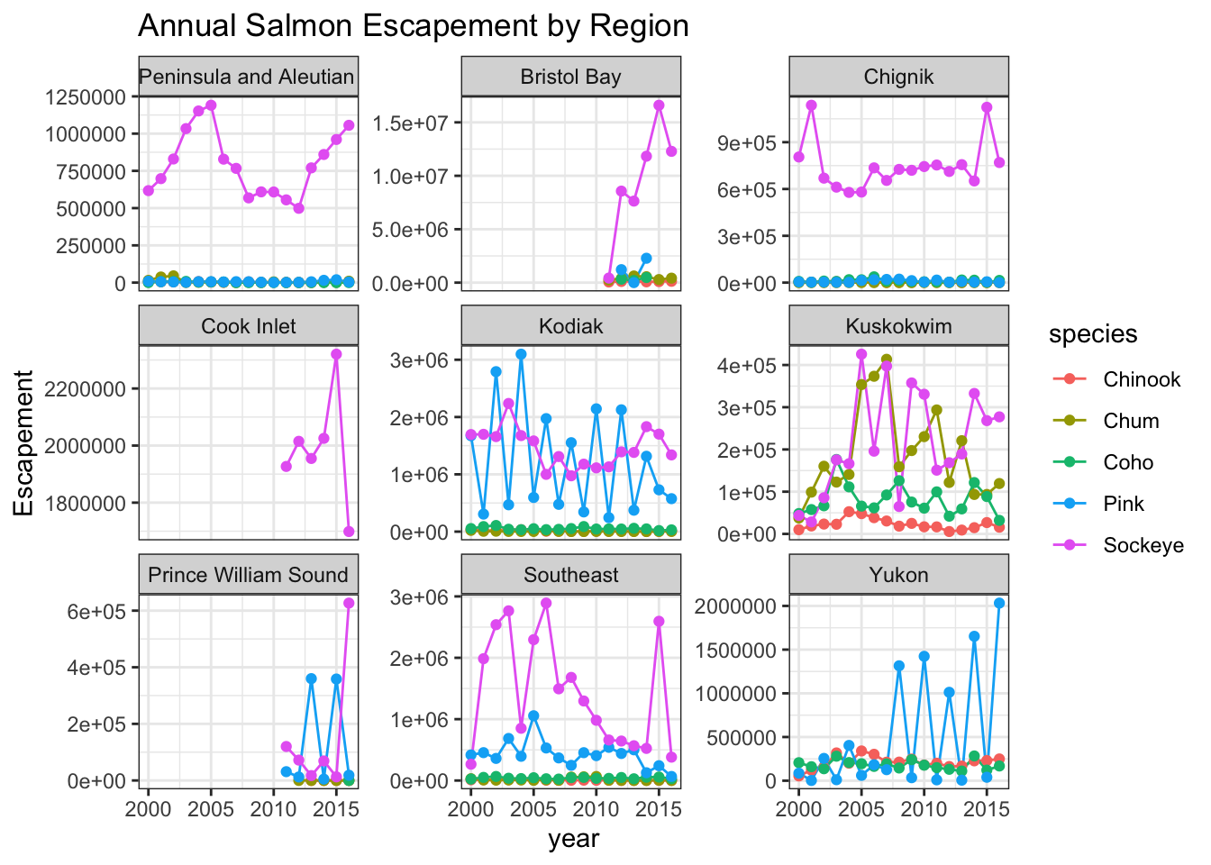
You can see that the theme_bw() function changed a lot of the aspects of our plot! The background is white, the grid is a different color, etc. There are lots of other built in themes like this that come with the ggplot2 package.
Exercise
Use the RStudio auto complete, the ggplot2 documentation, a cheat sheet, or good old Google to find other built in themes. Pick out your favorite one and add it to your plot.
Themes
## Useful baseline themes are
theme_minimal()
theme_light()
theme_classic()
The built in theme functions (theme_*()) change the default settings for many elements that can also be changed individually using the theme() function. The theme() function is a way to further fine-tune the look of your plot. This function takes MANY arguments (just have a look at ?theme). Luckily there are many great ggplot resources online so we don’t have to remember all of these, just Google “ggplot cheat sheet” and find one you like.
Let’s look at an example of a theme() call, where we change the position of the legend from the right side to the bottom, and remove its title.
ggplot(annual_esc_2000s,
       aes(x = year,
           y = escapement,
           color = species)) +
    geom_line() +
    geom_point() +
    facet_wrap( ~ sasap_region,
                scales = "free_y") +
    labs(title = "Annual Salmon Escapement by Region",
         y = "Escapement") +
    theme_light() +
    theme(legend.position = "bottom",
          legend.title = element_blank())
Note that the theme() call needs to come after any built-in themes like theme_bw() are used. Otherwise, theme_bw() will likely override any theme elements that you changed using theme().
You can also save the result of a series of theme() function calls to an object to use on multiple plots. This prevents needing to copy paste the same lines over and over again!
my_theme <- theme_light() +
    theme(legend.position = "bottom",
          legend.title = element_blank())
So now our code will look like this:
ggplot(annual_esc_2000s,
       aes(x = year,
           y = escapement,
           color = species)) +
    geom_line() +
    geom_point() +
    facet_wrap( ~ sasap_region,
                scales = "free_y") +
    labs(title = "Annual Salmon Escapement by Region",
         y = "Escapement") +
    my_theme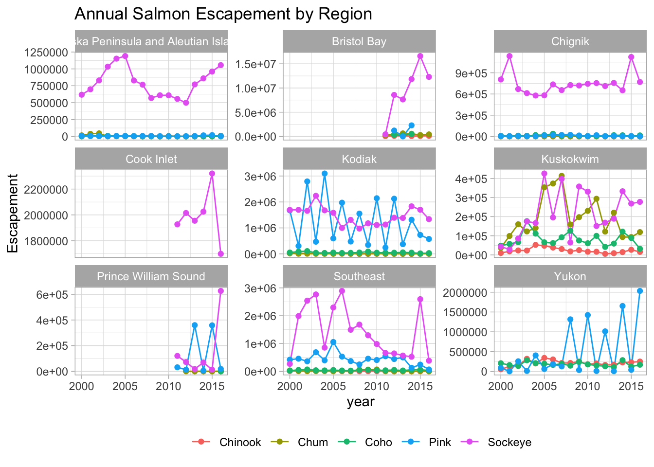
Exercise
- Using whatever method you like, figure out how to rotate the x-axis tick labels to a 45-degree angle.
Hint: You can start by looking at the documentation of the function by typing ?theme() in the console. And googling is a great way to figure out how to do the modifications you want to your plot.
- What changes do you expect to see in your plot by adding the following line of code? Discuss with your neighbor and then try it out!
scale_x_continuous(breaks = seq(2000, 2016, 2))
Answer
## Useful baseline themes are
ggplot(annual_esc_2000s,
       aes(x = year,
           y = escapement,
           color = species)) +
    geom_line() +
    geom_point() +
    scale_x_continuous(breaks = seq(2000, 2016, 2)) +
    facet_wrap( ~ sasap_region,
                scales = "free_y") +
    labs(title = "Annual Salmon Escapement by Region",
         y = "Escapement") +
    my_theme +
    guides(x=guide_axis(angle = 45))
10.3.3.3 Smarter tick labels using scales
Fixing tick labels in ggplot can be super annoying. The y-axis labels in the plot above don’t look great. We could manually fix them, but it would likely be tedious and error prone.
The scales package provides some nice helper functions to easily rescale and relabel your plots. Here, we use scale_y_continuous() from ggplot2, with the argument labels, which is assigned to the function name comma, from the scales package. This will format all of the labels on the y-axis of our plot with comma-formatted numbers.
ggplot(annual_esc_2000s,
       aes(x = year,
           y = escapement,
           color = species)) +
    geom_line() +
    geom_point() +
    scale_x_continuous(breaks = seq(2000, 2016, 2),
        guide=guide_axis(angle = 45)) +
    scale_y_continuous(labels = comma) +
    facet_wrap( ~ sasap_region,
                scales = "free_y") +
    labs(title = "Annual Salmon Escapement by Region",
         y = "Escapement") +
    my_theme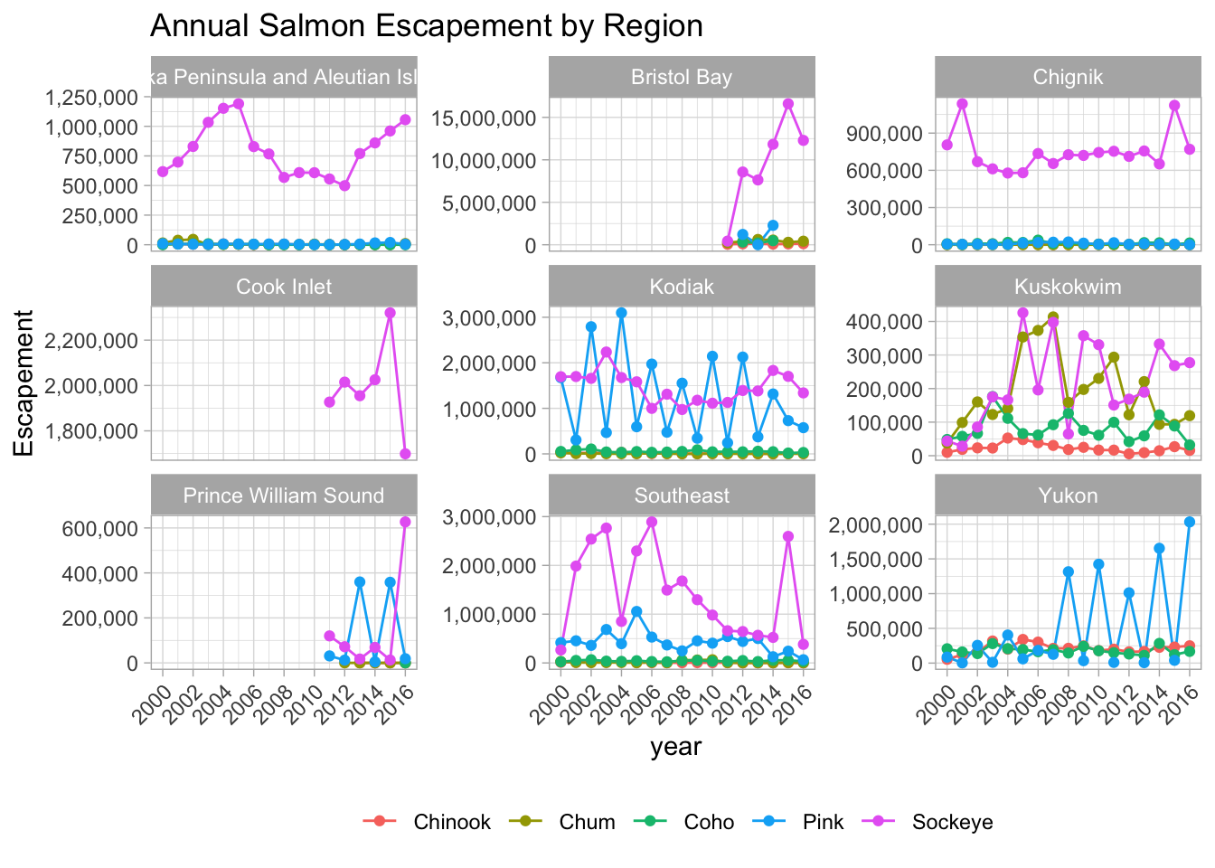
Let’s look at one more version of this graphic, with even fancier label customization. First, we’ll supply names to the scale_*() calls, which ggplot then uses as the default axis titles. Secondly, we’ll add an even fancier label specification for the y axis, dynamically adjusting the units. Finally, we’ll fix the issue with truncated text in the long facet title, by using a labeller function. While we’re at it, will also use a smaller size for the points.
ggplot(annual_esc_2000s,
       aes(x = year,
           y = escapement,
           color = species)) +
    geom_line() +
    geom_point(size=1) +
    scale_x_continuous("Year",
        breaks = seq(2000, 2016, 4),
        guide = guide_axis(angle = 45)) +
    scale_y_continuous("Escapement",
        label = label_comma(scale_cut = cut_short_scale())) +
    facet_wrap( ~ sasap_region, scales = "free_y",
        labeller = labeller(sasap_region = label_wrap_gen())) +
    labs(title = "Annual Salmon Escapement by Region") +
    my_theme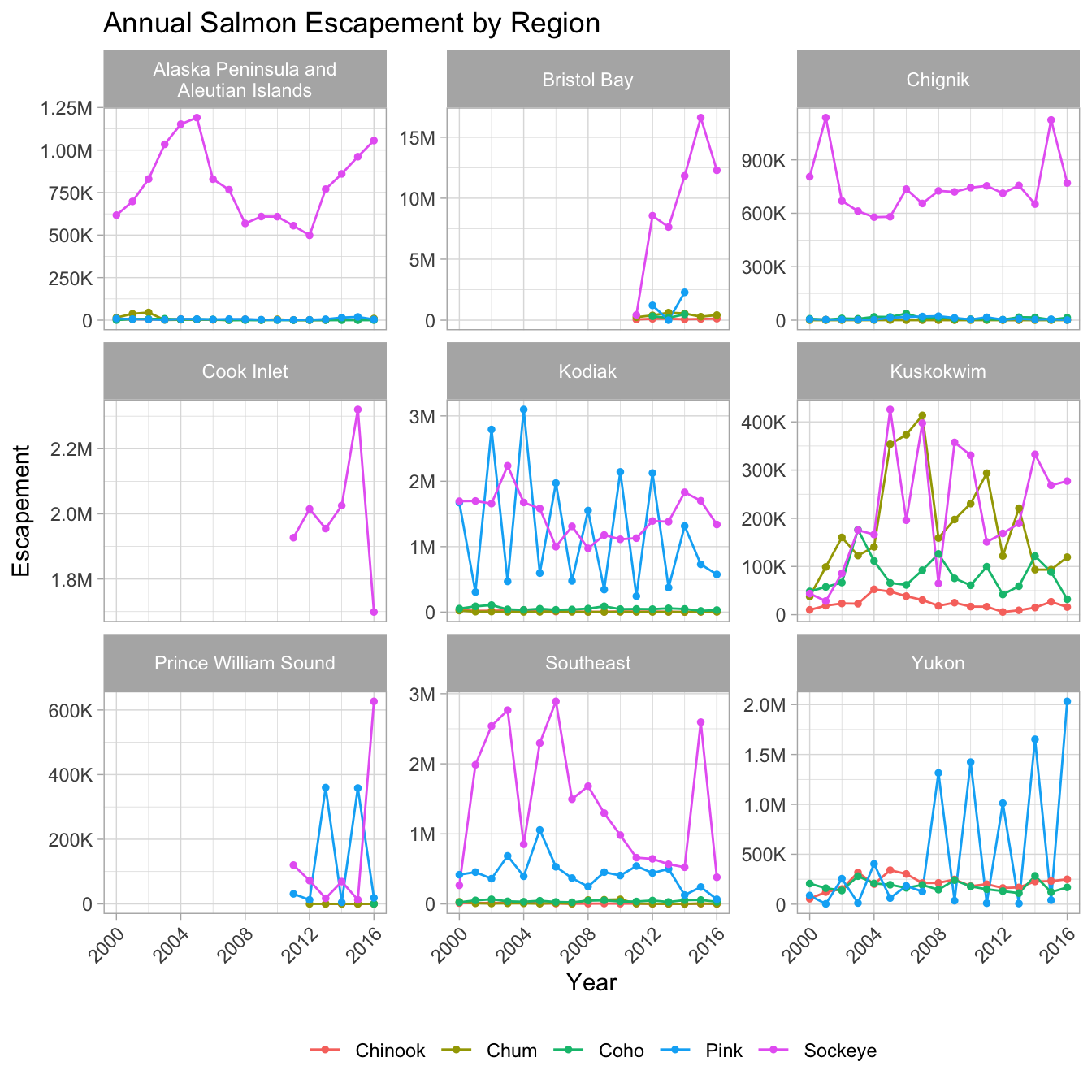
10.3.3.4 Saving plots
Saving plots using ggplot is easy! The ggsave() function will save either the last plot you created, or any plot that you have saved to a variable. You can specify what output format you want, size, resolution, etc. See ?ggsave() for documentation.
ggsave("figures/annualsalmon_esc_region.jpg", width = 8, height = 6, units = "in")10.4 Interactive visualization
Now that we know how to make great static visualizations, let’s introduce two other packages that allow us to display our data in interactive ways.
10.4.1 Tables with DT
The DT package provides an R interface to DataTables, a Javascript library for rendering interactive tables in HTML documents. In this quick example, we’ll create an interactive table of unique salmon sampling locations using DT. Start by loading the package:
library(DT) # interactive tablesUsing the escape data.frame we worked with above, create a derived version that conains unique sampling locations with no missing values. To do this, we’ll use two new functions from dplyr and tidyr: distinct() and drop_na().
locations <- escape %>%
    distinct(location, latitude, longitude) %>%
    drop_na()
Now let’s display this data as an interactive table using datatable() from the DT package.
datatable(locations)10.4.2 Maps with leaflet
The leaflet package is similar to the DT package in that it wraps a Javscript library for creating interactive data widgets that you can embed in an HTML document. However, whereas DT is used to produce a tabular data viewer, leaflet used to creating an interactive map-based viewer in cases where you have geographic coordinates in your data.
As usual, start by loading the package:
library(leaflet) # interactive mapsNow let’s do some mapping! Similar to ggplot2, you can make a basic leaflet map using just a couple lines of code. Also like ggplot2, the leaflet syntaxs follows a same pattern of first initializing the main plot object, and then adding layers. However, unlike ggplot2, the leaflet package uses pipe operators (%>%) rather than the addition operator (+).
The addTiles() function without arguments will add base tiles to your map from OpenStreetMap. addMarkers() will add a marker at each location specified by the latitude and longitude arguments. Note that the ~ symbol is used here to model the coordinates to the map (similar to facet_wrap() in ggplot).
leaflet(locations) %>%
    addTiles() %>%
    addMarkers(
        lng = ~ longitude,
        lat = ~ latitude,
        popup = ~ location
    )
Although it’s beyond the scope of this lesson, leaflet can do more than simply mapping point data with latitude and longitude coordinates; it can be used more generally to visualize geospatial datasets containing points, lines, or polygons (i.e, geospatial vector data).
You can also use leaflet to import Web Map Service (WMS) tiles. Here is an example that uses the General Bathymetric Map of the Oceans (GEBCO) WMS tiles. In this example, we also demonstrate how to create a more simple circle marker, the look of which is explicitly set using a series of style-related arguments.
leaflet(locations) %>%
    addWMSTiles(
        "https://www.gebco.net/data_and_products/gebco_web_services/web_map_service/mapserv?request=getmap&service=wms&BBOX=-90,-180,90,360&crs=EPSG:4326&format=image/jpeg&layers=gebco_latest&width=1200&height=600&version=1.3.0",
        layers = 'GEBCO_LATEST',
        attribution = "Imagery reproduced from the GEBCO_2022 Grid, WMS 1.3.0 GetMap, www.gebco.net"
    ) %>%
    addCircleMarkers(
        lng = ~ longitude,
        lat = ~ latitude,
        popup = ~ location,
        radius = 5,
        # set fill properties
        fillColor = "salmon",
        fillOpacity = 1,
        # set stroke properties
        stroke = TRUE,
        weight = 0.5,
        color = "white",
        opacity = 1
    )
Leaflet has a ton of functionality that can enable you to create some beautiful, functional, web-based maps with relative ease. Here is an example of some we created as part of the State of Alaskan Salmon and People (SASAP) project, created using the same tools we showed you here.
10.5 ggplot2 Resources
- ggplot2: Elegant Graphics for Data Analysis, Hadley Wickham et al (online edition)
- Customized Data Visualization in
ggplot2by Allison Horst. - A
ggplot2tutorial for beautiful plotting in R by Cedric Scherer. - Why not to use two axes, and what to use instead: The case against dual axis charts by Lisa Charlotte Rost.